Plotting binary outcomes
library(tidyverse)
library(binom)
Someone had a relatively straight-forward question: They had sets of binary outcomes for different response variables, and wanted to display them all in a simple way that highlighted both the probability of success and amount of data they had for each observation. There are more than a few ways to do it, and it can be hard to determine which is best without seeing them, so let’s look at a few examples and see which we like!
Data Generation
I don’t have the data, so I’ll generate a dummy data set. We’ll represent each event with a letter of the alphabet, randomly generate success probabilities for each, and then randomly assign the total number of observations:
set.seed(20190914)
tb <- tibble(responses = letters[1:10],
             results = runif(10, 0, 1),
             nobs = rpois(10, 10) * 4,
             nsuccess = round(results * nobs, 0),
             nfailure = nobs - nsuccess)
Plotting points
One approach here is to plot each point:
ggplot(tb, aes(x = responses, y = results)) + geom_point() +
  coord_cartesian(ylim = c(0, 1)) + theme_bw()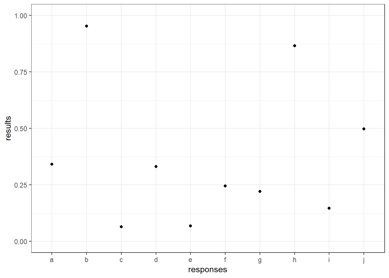
This seems reasonable enough, but it doesn’t communicate the number of of observations clearly. One way to do this is to add on confidence intervals. To do this, I’ll use the function binom.agresti.coull, which comes from the package binom that you may need to install if you haven’t already. It uses the Wilson Score method, which is my preferred approach. (Use ?binom.confint to find information on other methods available binom.):
# install.packages("binom")

library(binom)

ci_wrapper <- function(x, n, whichside, ...){

  thisside <- ifelse(whichside == "lower", "lower", "upper")

  binom.agresti.coull(x, n, ...)[[thisside]]
}

tbwithci <- tb %>%
    mutate(lcb = map2_dbl(nsuccess, nobs, ci_wrapper, whichside = "lower"),
         ucb = map2_dbl(nsuccess, nobs, ci_wrapper, whichside = "upper"))

ggplot(tbwithci, aes(x = responses, y = results)) + geom_point() +
  coord_cartesian(ylim = c(0, 1)) + theme_bw() +
  geom_errorbar(aes(ymin = lcb, ymax = ucb))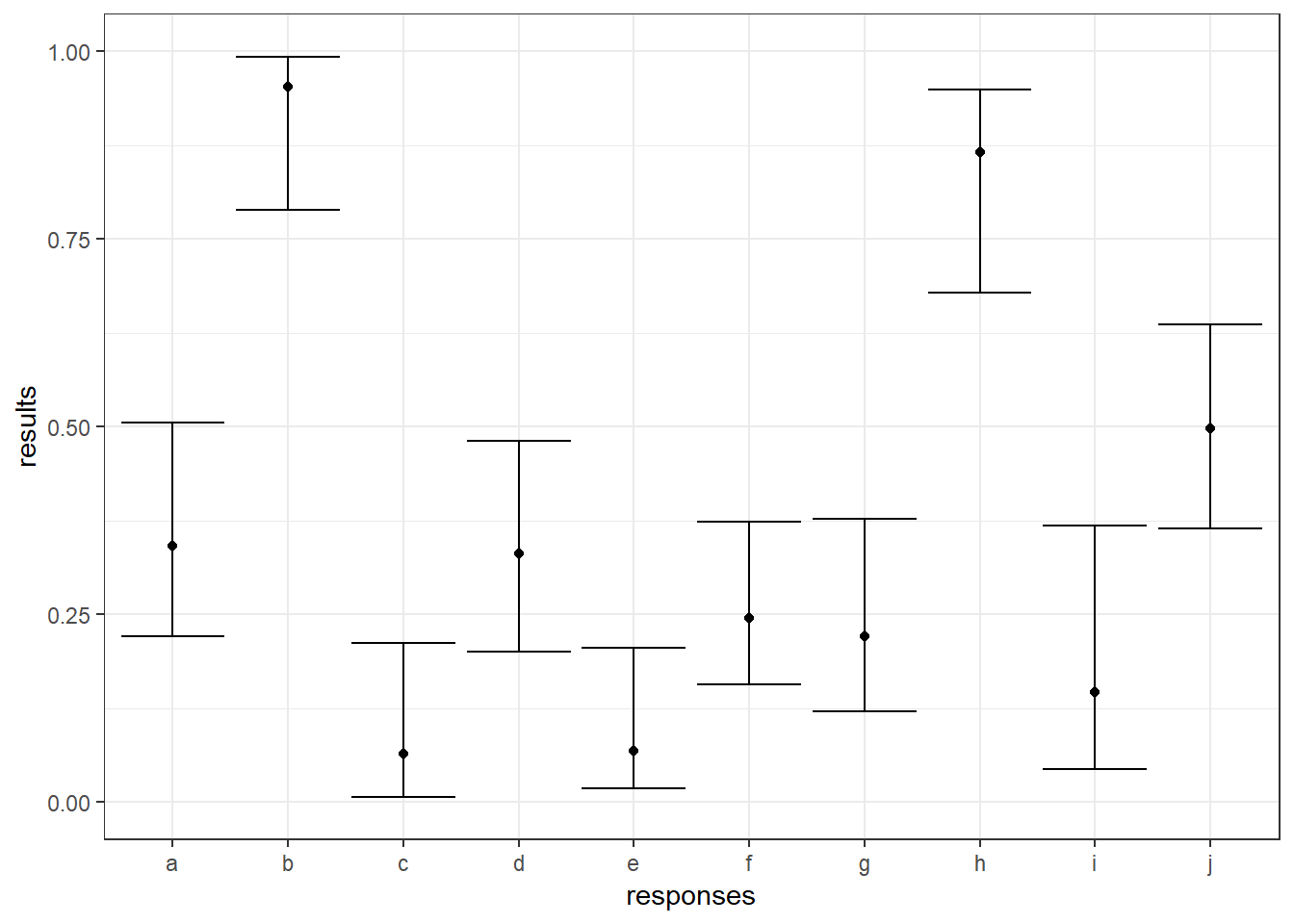
If error bars aren’t to your taste, you could also modify the size and/or color of the points based on the number of observations. Below, I do both:
ggplot(tb, aes(x = responses, y = results, color = nobs, size = nobs)) + geom_point() +
coord_cartesian(ylim = c(0, 1)) + theme_bw() 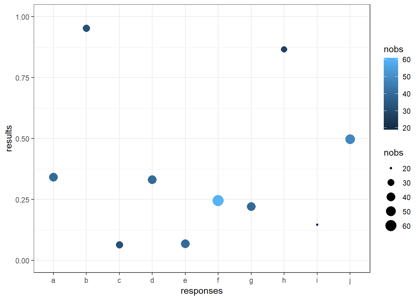
These approaches work just fine if your goal is simply to convey the sample sizes for each outcome variable and you’re not interested in actually modeling success probabilities or something like that.
Bar charts
The other reasonable possibility here is bar charts, specifically stacked bars. For these, we need the data in a different format:
tblong <- tb %>%
  gather(nsuccess, nfailure, key = "outcome", value = "count") %>%
  mutate(outcome = recode(outcome, nsuccess = "Successes", nfailure = "Failures"))
This allows us to tell ggplot to build our bars:
ggplot(tblong, aes(x = responses, y = count, fill = outcome)) +
  geom_bar(stat = "identity", position = "stack", color = "black") +
theme_bw() 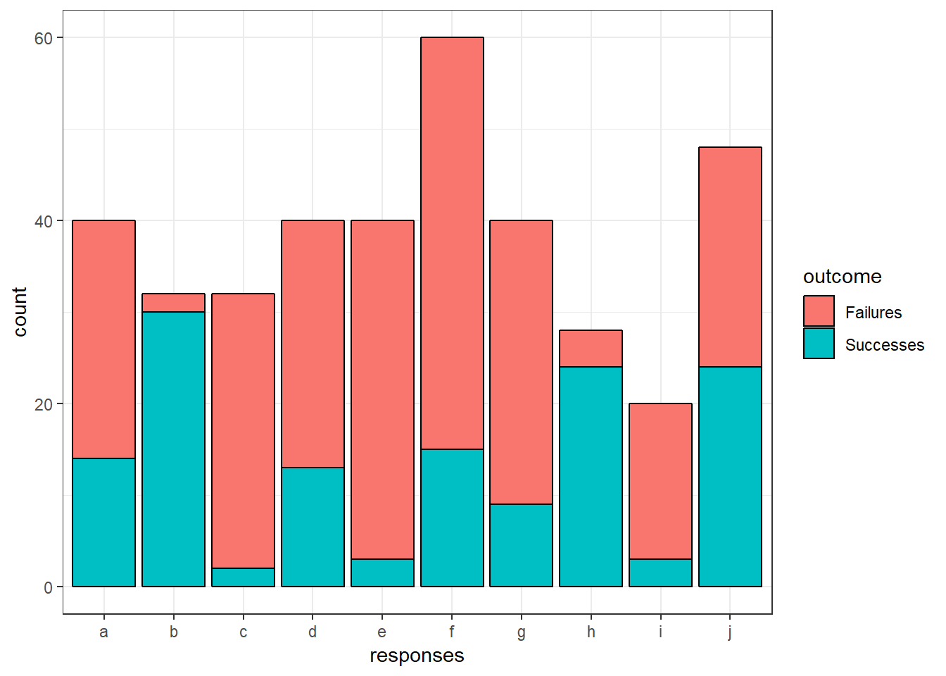
If we want to, we can also add text labels to tell us how many observations fall into each section of each bar:
ggplot(tblong, aes(x = responses, y = count, fill = outcome)) +
  geom_bar(stat = "identity", position = "stack", color = "black") +
  geom_text(stat = "identity", aes(label = count), position = position_stack(vjust = 0.5)) +
theme_bw() 
Conclusion
And there you have it! Multiple ways to plot some very simple data. Depending on your goals, audience, and data, some of the above will probably work well while others won’t. I haven’t done much to enhance the look of these plots, using default ggplot settings everywhere except for setting theme_bw(), so there’s doubtless plenty to be accomplished improving the visual appearance.