Bad Data Science in the Wild
Today’s example comes from a Reddit post on USMNT subreddit that shows the proportion of minutes played by US Men’s National Team (USMNT) players who participated in the January mini-camp the USMNT does every year. OP made the following plot:
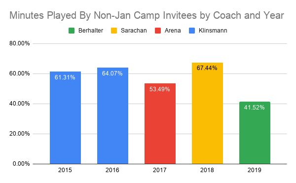
IDK what this actually means, but I sure know what people will think when they see it!
Background
The context here is that fans are generally dissatisfied with the USMNT right now, and one of the reasons is that Gregg Berhalter (the USMNT coach) doesn’t call up the right players. Specifically, he favors players playing the US domestic league (Major League Soccer or MLS) over players playing in foreign leagues. Foreign leagues are generally stronger, so players playing in them tend to be better than players playing in MLS, so showing favoritism to MLS players is actively hurting the National Team. Or so the theory goes. January Camp attendance is being used as a proxy for “MLS players” because it’s a special camp that doesn’t occur during a standard international window when professional clubs are obligated to release players to play/practice with their national teams. MLS has a different calendar than European leagues, and January is part of their off-season. Therefore, it’s typically only MLS players that go to the January camp, and the group of players there is generally weaker than the “regular” USMNT.
With all that out of the way, this plot shows that, in Berhalter’s one year at the helm, he’s allocated fewer minutes to players who didn’t attend the January Camp relative to his three predecessors. The implication is that this is evidence that Berhalter is showing favoritism towards MLS players when compared to other coaches. Regardless of whether or not that’s true, that’s bad analysis.
Bad Data Science
This bares the hallmarks of poor data science. The plot itself is … fine. Primary colors provide good contrast but don’t function well for folks with any type of color blindness. The plot isn’t cluttered, though going out two decimal points on your numbers (especially the y-axis) is overkill, IMO. The only real gripe is that the legend is in reverse order of the x-axis and chronology. But all of that’s fine for something someone through together quickly for some Reddit post.
The issue here is the lack of thought about what’s actually going on and, specifically, how these data were generated. Data generation is one of my hobbyhorses. In this case, a moment’s thought would lead you to realize how inadequate this “analysis” is.
Essentially, these data are generated based on which players play available minutes for the USMNT and which players participated in the January camps each year. The coach is one factor in this process, but it’s arguably not even the biggest. Other factors include:
- Which players are in the player pool
- Which games are played (friendly vice FIFA-sanctioned tournaments)
- Who is healthy
- Where the games take place (friendlies in Europe are easier for EU-based players to attend)
- Who is called into the January camp
How many minutes are available and how they are distributed varies from year to year. To date in 2019, the US has played 16 games, six of which were part of the Gold Cup tournament. Rosters for this tournament were locked once it began, meaning if you weren’t chosen for the 23-player roster, you weren’t in. We also played 8 friendlies over three FIFA windows plus two games coming out of the January Camp. We also had two UEFA Nation’s League games in October window and will have two more in the November window, starting tonight against Canada! So that’s a total of about 16,000 minutes already played in 2019.
In 2018, the US played no FIFA-sanctioned games because we missed the World Cup. We played 11 friendlies across five or six windows depending on how you want to count it. We also played four of those games in Europe vice none in 2019.
In 2017, most games were for World Cup Qualifying and were FIFA-sanctioned and in the Western hemisphere.
So across each year, we don’t have a homogeneous sample of games. And that matters for which players get what minutes.
Players are called up in groups for each window, so if a player isn’t called up (for health or whatever reason) for one window, they miss two games, not just one. This is trebly so for the Gold Cup, where the 23-man roster was fixed for the full six-game slate. And if a player misses one window with an injury, they’re more likely than they would otherwise be to miss the next window. This means that there’s a ton of correlation both between and within windows attributable solely to health.
Game location also matters. It’s easier for European players to play in matches in European facilities. Club teams aren’t obligated to release players for non-FIFA-sanctioned games, so clubs and national teams often have to work out agreements about when and how often players are released to friendlies. European clubs are more inclined to release players for friendlies when the players don’t have to travel trans-Atlantic.
And then there’s the question of who is even in the player pool at a given time. Due to issues like age and form, the available (or useful) player pool is ever-changing. Players that will likely be too old to play in the next upcoming World Cup are often left off rosters in the preceding years in favor of players who will likely be in the team. Players who are in good form for one window are likely to maintain that form for the next window. This introduces additional correlation into player selection patterns.
The data generation process implied by the initial plot is:
\[\%PT_{Jan} = f(Coach)\]
In reality, it’s probably something like:
\[\%PT_{Jan} = f(Coach, Pool_{Yr}, Games(Windows_{Yr})|Health_{Yr}, JanParticipants_{Yr})\]
In this model, the percentage of playing time allocated to players who participated in the January camp is attributable to a non-linear function of the coach, the player pool at the time, the set of games nested within the set of windows for that year, conditional on the health for that year and the January camp participants for that year (since that’s not a stable group). To estimate this, even if we assumed only one model term for each input, we’d need something like 17 degrees of freedom (3 for the Coach effects, 4 for player pools, 4 for health, 4 for January camp participants, 1 for game location and 1 for game type. ) to specify this model.
But maybe we have the data to support a model of that complexity?
So how much data are we looking at here?
From my perspective, there are three good candidates for our “unit of observation”. The first is to look at playing time. Think of each minute of playing time as a binary trial with an outcome of “Jan Camp Participant” or “NOT Jan Camp Participant”. For 2019, we’d have about 16,000 observations. But this is absurd. We can do this, but we’d have to deal with some INTENSE correlation structures. If a player plays the first minute of a game, they’ll almost definitely play the second minute. So we clearly have way less than 16,000 independent observations.
What about treating each game as a draw from a beta distribution? That’s reasonable and would give us 16 observations from 2019 to date. … but as discussed above, we’d expect largely similar player pools for each game, and so these aren’t really independent either. We could go down to the window level, but that leaves us at like 4-8 “observations” per year, and that’s before we get into the window-to-window correlation.
The closest we can get to independent observations is at the Year level. That is, we treat each year as independent and do our estimation accordingly. That’s fine as far as it goes, except (1) player pools are still correlated year-to-year, (2) we’d be left with only five observations and (3) that means we only observe most coaches exactly once!
Uncertainty estimation
Still, we can soldier on, and if we ignore all the factors besides Coach, we can actually still estimate a variance:
pct_international <- c(61.31, 64.07, 53.49, 67.44, 41.52)
coach <- c("Klinsmann", "Klinsmann", "Arena", "Sarachan", "Berhalter")

tb <- data.frame(pct_international = pct_international,
                 coach = coach)

fit <- lm(pct_international ~ coach, data = tb)
anova(fit)
## Analysis of Variance Table
##
## Response: pct_international
## Df Sum Sq Mean Sq F value Pr(>F)
## coach 3 424.09 141.365 37.115 0.1199
## Residuals 1 3.81 3.809When we do our test, we don’t find a statistically significant Coach effect. (I tried this with everyone else in on group and Berhalter in the other, and you still don’t get a p-value less than 0.05, though its closer.)
And remember, this is a hypothesis test that we know has bad assumptions baked into it. We know that these years aren’t independent because of the player pools and because the games that comprise each year vary substantially from one year to the next.
Better approaches?
So what’s the “right” way to analyze these data? Well, I think this is case when the juice isn’t worth the squeeze. For one thing, you can look at these five years’ worth of data and attribute it to any number of things beyond the coach. It’s an empirical fact that in 2019, the USMNT has made use of fewer EU-based players than in former years. (Though it doesn’t appear that the difference is statistically significant at the 0.05 level, for whatever that’s worth.) But you can attribute that to a lower overall level of talent (and hence fewer international-calibur players), injuries to key international players, a domestic league that continues to grow in size, any number of other things that I’m not clever enough to think of, or even just noise.
But if you did want to try to build a model and estimate uncertainty, you should at least look at the game-level and include a within-window and temporal correlation structure. You should ignore the arbitrary annual cut-offs (e.g., don’t break Klinsmann’s two years apart). You should try to control for player pool and age. (Maybe total minutes of US-eligible players in Top 5 EU leagues and then their average age? Probably too blunt, but there ya go.) And of course differentiate between friendlies and tournament games as well as EU vs. Western Hemisphere games.
But even then, you’re going to have a helluva time defining an actual error distribution.
Conclusions
The plot we started out with is one of the most dangerous things in Data Science. It’s fine for sports fans that just want to complain about their crappy manager, but when I see this type of thing professionally, I cringe. It’s a simple chart to make, it’s conveying factual information that’s easy to understand, it’s not obviously sloppy, and it’s wide open to interpretation. But it’s such a gross over-simplification that you’ll be hard-pressed to understand anything of value from it. It gives the veneer of empiricism to whatever conclusion you want to draw from it.
Luckily, if you take a minute to think the data summarized by the chart, you quickly realize what a gross oversimplification it is. And it’s taking that extra minute to think that is the key.