MS Paint > ggplot?
Not really, but sometimes!
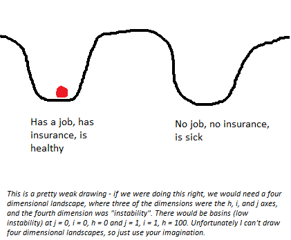
A few recent posts from Astral Codex Ten (ACX) make use of some stylized plots. Here’s an example:
This looks like … well, it looks like it was drawn using MS Paint. And I think that in this case, it’s the perfect tool for the task!
Tools matter
There are lots of good, general rules for graphical design. I’ve discussed a couple ideas on here, and there are tons of resources out there. But one thing that I haven’t seen widely discussed is how the visual characteristics of a plot, including the tool used to make it, affect how people interpret the presented information.
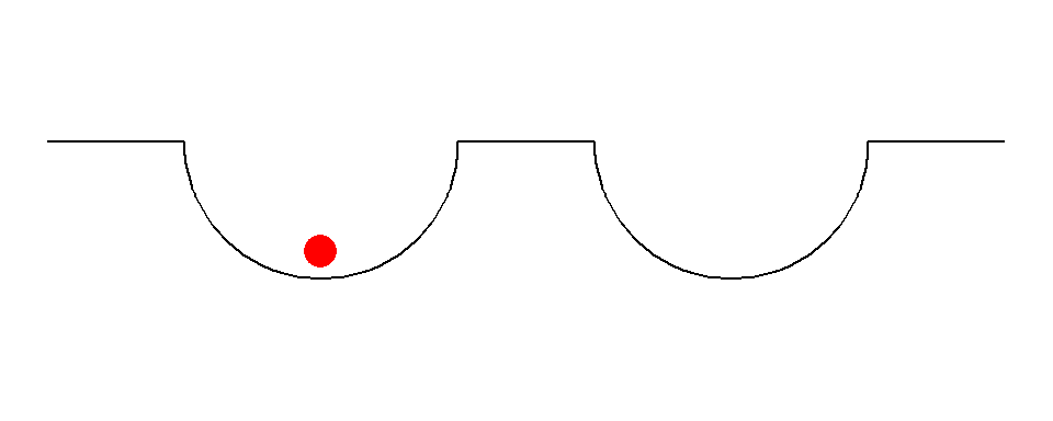
Take the ACX plot above. Instead of using MS Paint, the author could’ve made the same picture using, for example, ggplot:
Two things to note:
1. That took me far longer to make than a simple MS Paint sketch would’ve
2. It looks a lot worse than the original
I care less about (1), but (2) is crucial! My sketch fails for a couple of reasons.* One is a technical issue, namely that the phenomena ACX is trying to describe with the graph should not have sharp corners between the curved portions and the flat portions of the picture. I could fix that by making more segments to the line I drew, but now I’m throwing even more time at this thing. The more important reason is that my plot gives the illusion of precision.
What ACX sketeched was a general phenomenon. He wasn’t using precise numbers or empirical data to draw his plot, and by making a precise picture with exact lines and points, my picture risks conveying a higher level of precision than the picture warrants. You could argue that my picture looks “nicer” or “more professional”, but I think that gives it a veneer of precision that isn’t appropriate.
By using a hastily-drawn sketch made with a non-professional drawing tool instead of an exactly plotted (down to the coordinate!) picture from tool used by data scientists, ACX conveys the message that “this is just a sketch” without having to say “This is just a sketch.” People won’t try to nitpick inflection points or understand what the relative distance between the nadir of the two dips means. They won’t assume that both dips always have to be the same size (or, had I drawn them differently, that they could not be the same size), because the MS Paint sketch makes it impossible to tell whether they should be anything other than “kinda similar looking”. By using a tool that necessarily limits the precision of the information conveyed, ACX effectively communicates to his audience what information on the plot is important.
Other considerations
Does this mean I’m going to start using MS Paint for my plots at work? Hell no! Or at least not when I’m doing analysis or writing a report. In those cases, the requirement to appear professional trumps any type of advantage one might gain in clarity from using a sketch. But I might think more about how a plot or graph I build conveys precision and certainty and whether that is warranted by the data and analysis it is showing. Just another way that graphical choices encode information, whether its done consciously or not!