Analysis Philosophy
From what I understand, teaching professors (maybe all professors?) write a “Philosophy of Teaching Statement”. The goal of this documen is to describe the individual’s approach to teaching and why they use that approach. It basically says, “Here’s what I do, and here’s why I do it,” and maybe you get into a little bit of how they got there. In my view, it’s akin to a teaching world-view. It’s an opportunity for a professor to organize (and interrogate a little) their entire approach to their chosen profession.
That sounds to me like a useful exercise, so here goes my Philosophy of Analysis Statement!
The things that have had the largest impact on the way I approach analysis
My academic background is Statistics and Economics (the latter in undergrad, the former for my master and PhD). My professional background includes a lot of experimental design and quantitative data analysis on a wide variety of data sets. The subject matter is defense testing tends to be complex. While many times we have designed tests, they’re rarely executed according to the DOE. Data sets I’ve dealt with range from $n < 10$ to an $n$ in the hundreds of thousands, and they cover everything from tight, hyper-specific DOEs to purely observational studies. The kicker is trying to turn this analysis into something you can trust a Congressional staffer to understand.
On top of this mix, I’d add sports, politics, and policy into my bag of influences. I’ve always found public policy debates interesting and read a lot of papers both when I was studying Economics and since then. And sports statistics is one of the things that got me into looking for ways to do data analysis in the first place. I started with Baseball Prospectus back when Nate Silver and Kevin Goldstein were still there. Due to the nature of my work, many of the examples I’ll use on this blog will come from sports and politics rather than my work directly.
So that’s where this comes from.
How I approach data analysis
Briefly, “Don’t be wrong”. Slightly less briefly, “Be as little wrong as possible.” At this point, everyone’s heard the old George Box saw about models, and this is more or less the same. But my point is to be constantly vigilent for ways that humans can make errors when looking at data and do my best to avoid them. Aside from the typical Khaneman and Tversky-style cognitive errors the human brain tends to make when approaching randomness, there are a few points I tend to focus on. These are things that bring complexity to problems and analyses but tend to be easiy to avoid or overlook. I’ll briefly discuss each in turn.
Dimensionality
Reality is highly dimensional. As a result, so are most of the problems we look at. That means that getting full, comprehensive models of them is very challenging. We typically get around this by collapsing the problem into a workable number of dimensions and addressing those. Examples abound, but sports statistics provide convenient ones. From baseball to basketball to hockey to whatever else you want, people are always trying to devise useful single-number summaries of player value. The motivation is obvious. The job of “sports player” requires a combination of specific athletic abilities, technical skills, and mental capabilities. Everyone doing it at a professional level is an outlier relative to the overall population, and no two players are identical, even when they are identical twins. So if we want to have any hope of understanding this problem, we’ve got to find some way to collapse those dimensions down.
This isn’t a statistics or data science thing, either. MLB scouts were reducing position players to five tools since before Billy Bean was playing let along a GM.
But often times by collapsing a high-dimensional problem into a few-deminsional problem introduces new challenges. The single-number stats for player evaluations mentioned above have well-known deficiencies. It’s just the nature of the best that when you reduce dimension, you lose information. Well-informed practitioners understand the limitations of their tools and are able to account for these deficiencies as part of their analysis. For example, Real Plus-Minus (RPM) is a single-number statistic that ESPN defines as follows:
Player’s estimated on-court impact on team performance, measured in net point differential per 100 offensive and defensive possessions.
And it does this pretty well. But folks familiar with how it behaves. They know that it’s not particularly stable with small sample sizes, so you should take it with a huge grain of salt the first few weeks (months?) of a season. They also know that it doesn’t account very well for opponent’s shooting “luck”. (I put luck in scare quotes because determining what is luck and what isn’t measurable and whether the distinction is meaningful beyond semantics is a whole other post.) RPM is also weirdly disconnected from the sport of basketball. Depending on your team’s composition, grabbing the player with the highest RPM won’t always be the best way to improve it. Becuase of these limitations (and others), some folks simply dismiss deminsion-reducing statistics like RPM out of hand.
I find a similar phenomena arises when non-statisticians talk about p-values. They often fall into one of two camps. The first camp consists of True Believers. They’re not sure how to winnow their model or determine which factors matter the most, so they look to the p-value to save them. They adhere to their chosen $\alpha$-level with religious fervor. The other camp dismiss p-values out of hand. They’re subject matter experts, and they know an important factor when they see one, damnit!
The answer of course is in the middile. My view is that p-values are useful tools, and I often use them for model selection and helping me determine whether a factor is important enough to call out in a report. But its always within the context of the larger problem. It’s always after taking into account those extra dimensions (the circumstances of the analysis, results from similar analyses, the potential relevance of the effect size, etc.) of the problem that he p-value has collapsed away.
Distributionality
I only get 1,750 hits on Google when I search for “Distributionality”, so maybe I should clarify what I mean, though I don’t think it’s anything profound.
That data follow distributions is a tautology. When this doesn’t appear the case, it means we’ve failed to properly model hte data generation function. The most typical failure mode is to assume that the distribution is simpler than it is. Statistics (and science, and human cognition, and …) is rife with simplifying assumptions, so there’s nothing inherenly wrong about them.
Take the opposite approach, and imagine modeling data using a purely empirical CDF. Your tool box is now limited, and a lot of inference is now harder, but those are mechanical problems. But you still haven’t solved the most challenging problems like, “What can I predict about a new observation that might come from a different sub-population?”
So we make basic assumptions, either about our data (“IID”) or about our inference (“Future observations come from the same distribution as my sample!”), all of which have dubious relation to reality.
The subpopulation thing is a real challenge, and it crops up all the time. One of the constant demands I have in my current job is summarizing complex systems that are used in a wide variety of environments in the most pithy way possible. How do you explain to that quintessential, “non-technical, executive-level” audience that, across a four-variable space, there are some places where the system works well, others where the performance is indistinguishable from the requirement, and a few where its disastrously bad in a few sentences, while being sure to include the reasons for this variation?
The most egregious place I see su-populations creep up is when political analysts are attempting to summarize polling results. Even for high-quality polls, they typically get on the order of $n = 1,0000$ respondents. Which is fine, right until they start breaking out the cross-tabs and talking about things like “non-white Hispanic males between the ages of 30 and 49”. My main gripe here isn’t the sample sizes they have for these inferences, which are necessarily limited. Rather, my complaint is the way such things are discussed. I can’t recall hearing even the most data-literate politics reporting (e.g., 538) point out variation across sub-groups in opinion polls then identify which factors are driving the differences and which are a result of correlation across factors. A brief example:
Suppose Americans over 65 favored Policy X by a 56% to 44% margin compared to a 48 to 52 difference among Americans 65 and under. Seems a simple story: Old people like Policy X! And a lot of times you see political reporting stop there. Or maybe they go one step further and note that, among Whites, the policy is favored 55% to 45, but non-whites are against it by a margin 42 to 58. Well, now we’ve got a conundrum, because $Age > 64$ is correlated with $Race != White$ in America. So was the initial reporting, about the difference in opinion being based on Age, correct? Incomplete? Useful? It’s hard to say, and this is a relatively simple example. You can break these polling results down along a number of additional dimensions (gender, political affiliation, geographic location, etc.) to get a much richer picture of how different groups of people feel about things, but you almost never see this in popular discussions because the samples aren’t big enough and the analysis is a bit more complex. It’s very frustrating, and in my view, means we typically don’t really understand what’s going on in these cases.
When I’m doing my own analyses, I try to bear this in mind. How many subpopulations am I really averaging over when I do my analysis? Are there more robust options (mixed models, etc.) for accounting for subpopulations? If I aggregate over subpopulations, am I distorting the results?
Conventional wisdom is that the most common failure mode for a statistical analysis is starting from the basis that your data is Gaussian. This is incorrect, IMO. The most common failure is in not accounting for the complexity of the “top-level” distribution and trying to treat data from many subpopulations as if they’re from a single, uniform population. Thinking properly about your data’s distribution and allowing it to be adequately complex is both challenging and fundamental to doing sound analysis.
Non-linearity
Nonlinearity is a commonly-misunderstood problem when it comes to data analysis, mostly because our profession has once again managed to find a way to use a simple-sounding term in a way that’s counterintuitive to lay audiences. (See also Artificial Intelligence is Dumb.) When people think about nonlinear response variables, they think of functions that have non-linear relationships. And we tell them that one of the assumptions required for regression is linear relationships between your predictor and response variables. But of course we can include nonlinear terms in our linear regression models provided there’s a linear relationship between the response and the nonlinear function of the predictor and ….
Anyways, the challenge isn’t fitting a regression with a quadratic term but rather recognizing when that quadratic term is necessary.
Nonlinearity and Prediction
There are a couple of reasons we build models. If we want to understand an underlying mechanism, we try to choose terms that are interpretable and reflect an underlying mechanism. If we choose a nonlinear term, it’s because we think there’s plausibly a nonlinear relationship. But this isn’t why we build models a lot of the time. These days, especially when you start talking about machine learning and data science, we’re less interested in underlying relationships and more interested in minimizing prediction error.
In just about ever intro statistics class you take, you’re taught not to predict outside of your data. “Extrapolation”, you’re told, “is dangerous and can lead you astray.” The rationale here is that the relationship between your variable may change outside the range where you’ve collected data. However, if your response surface is sufficiently nonlinear, interpolation can be equally dangerous. This isn’t typically taught in stats classes because (1) most of your models assume nice, smooth relationships and (2) data are often relatively small samples (or at least nothing that could plausibly be called “big data”) and so over-fitting is less likely to occur.
In complex, real-world problems, you’ll occasionally run into severely nonlinear response surfaces. More accurately, these are discontinuous response surfaces, where specific variable threshold result in “steps”. Suppose a team is considering tinkering with their lineup, substituting a better defensive player for one of their good shooters. Now generally, the team’s net rating will increase linearly with an individual player’s 3pt%. But if that percentage drops below a certain threshold (basically the point at which it becomes beneficial for the defense to allow that player to shoot whenever possible), the team can double off that player with impunity, potentially mucking up the entire team. So the same marginal decrease in 3pt% could take the half-court offense from “pretty good” to “average” or from “average” to “worst in the league” depending on how good the player is. In cases like these, its important to allow for severe nonlinearity in your estimators, or you’ll produce some unexpectedly large prediction errors.
The other side of that coin is the type of data science which fits highly non-linear predictive models. All flavors of neural networks and deep learning fall into this category. Here, the models are highly nonlinear because the data is, too. Unfortunately, this can make these models highly unstable. This is why you get adversarial examples and the like: Wherever you are in your model space, there’s always a super-steep curve somewhere nearby. Basically, to make problems like image recognition tractable, you’ve got to massively over-fit your models to a jagged, weird space.
And over-fitting (“too much nonlinearity”) can be as dangerous as under-fitting (“non enough nonlinearity”). Consider the examples below:
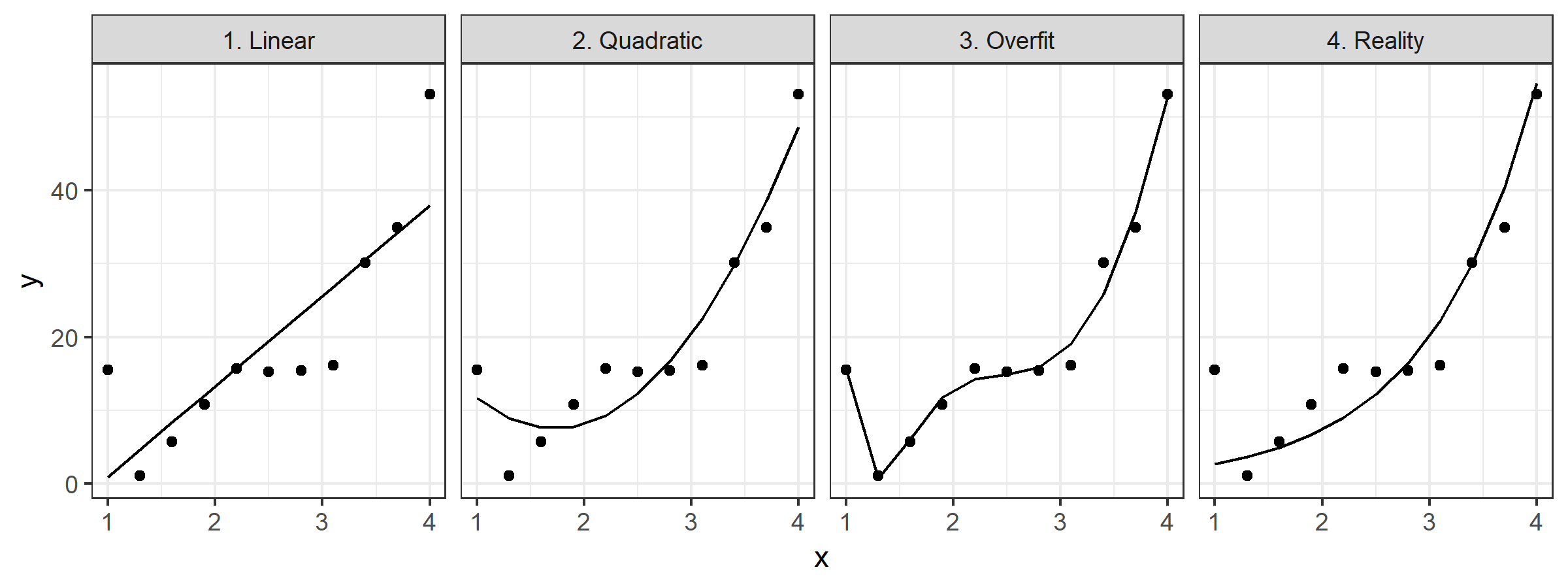
These are pretty trivial, but I think they do a good job of illustrating the point. If we were to try to use either of the first two fits beyond the support of our data, we’d make pretty egregious errors. But if we try to use the 3rd fit, we’d also make egregious errors even within the range of the data we’ve collected.
Complexity is complex
There’s no one-sized fits-all approach to dealing with this. The truth of the matter is that errors are inevitable when dealing with complex problems. The only thing to do is choose a strategy to minimize their frequency and magnitude. So I always try to think about whether it’s worse to build a model that’s too complex or too naive for a particular application. That way at least I’ll have a direction in which to iterate.