Is Scott well-calibrated?
Yesterday, Scott Alexander posted his annual predictions review post. I always enjoy this post because it’s externalized introspection. Scott takes the time to formally look at things he thought, consider how right he was about these things, and consider how it should update his thinking moving forward. Most people don’t do this informally let alone formally!
I want to respond to two things in the post, the latter of which is answering the question Scott only implies of whether he’s well-correlated or not. But first, Scott states:
50% predictions are technically meaningless since I could have written them either way – which makes it surprising I managed to get such an imbalance between right and wrong. I think I’m more wrong than should be statistically possible. I’m not sure what to think about that.
Scott’s more numerate than most, but I think he’s dead wrong here. An important component of being able to predict is to know what you don’t know and exactly how much you don’t know it. Making an even-odds prediction is saying something concrete and precise about your expectations about the likelihood of an event. (This is related to why flat priors aren’t necessarily uninformative.)
Another way to say this is that 50% predictions are critical for evaluating how well-calibrated you are. Scott looks briefly, but I wanted to give it a more thorough treatment. I’m going to embed my R code, because this is a fairly simple analysis, and I know other folks made their own predictions and might want to see how well-calibrated they are.
Chi-Squre Goodness of Fit
The simplest way to look at calibration is a Pearson Goodness of Fit test. You can follow the link to read about it, but basically you sum the squared differences in the Observed value in each bin against the valued you’d Expect under your null hypothesis, scaled by the number expected in each bin. In this case, we’ll use “Scott is properly-calibrated” as our Null.
So, for our data set, we have:
## Simple Pearson chi-square goodness of fit
ab <- tb %>%
  mutate("Observed" = n * p,
         "Expected" = n * bin_numeric / 100)
ab %>% select(bin, n, Observed, Expected)
## # A tibble: 6 x 4
## bin n Observed Expected
## <chr> <dbl> <dbl> <dbl>
## 1 50% 22 6 11
## 2 60% 15 8 9
## 3 70% 18 14 12.6
## 4 80% 13 10 10.4
## 5 90% 18 17 16.2
## 6 95% 8 6 7.6teststatistic <- ab %>%
summarise("ChiSq" = sum((`Observed` - `Expected`)^2/`Expected`))
pchisq(teststatistic$ChiSq, nrow(tb) - 1, lower.tail = F)## [1] 0.7106033The data set provided by Scott is the object, tb. (If you want to see how I got tb, I included the code at the end of the post). The “observed” are the number of predictions in each percentage bin Scott got right, and the “expected” is the product of the number of questions (n) with the probability associated with the bin. So for the 90% bin, Scott got 17 out of 18 questions right, and if he was properly calibrated, he’d get 16.2 questions right on average, or \(18 * .9\).
That p-value’s pretty large, so we fail to find adequate evidence to reject the null hypothesis that Scott is well-calibrated.
But this test is pretty under-powered. We might be able to do better by including past-year data to drive up our sample size, but instead, let’s try a visual approach.
Simultaneous prediction bounds
Prediction intervals are nice things to use for visualizing the potential uncertainty in our observations. (See for a lot more!) Here, we can use them to visualize whether Scott’s predictions fall outside the range of what we might expect to see.
A naive way to do this would be to look just at generate prediction bounds for each bin and plot each point independently. However, I want to consider Scott’s calibration across all prediction probabilities simultaneously. This means we’ve got to generate our prediction bounds simultaneously for each probability. The simplest way to do this is a Bonferroni correction:
We’ll use a simple Bonferroni correction to estimate bounds around each probability point such that we should only observe a point outside the bounds less than 5% of the time, assuming Scott’s predictions are properly calibrated.
The code chunk below generates the confidence bounds. They’re based on quantiles from Binomial distributions, with the lower and upper bounds being determined by our chosen \(\alpha\)-level (0.05), halved because we want two sides and divided by the number of comparisons (6) for our Bonferroni correction. After that, it’s just plotting.
tb %>%
  mutate(lower = qbinom(.05/2/nrow(tb), n, bin_numeric/100)/n,
         upper = qbinom(1 - .05/2/nrow(tb), n, bin_numeric/100)/n) %>%
  ggplot(aes(x = bin_numeric/100, y = bin_numeric/100, ymin = lower, ymax = upper)) +
  geom_ribbon(alpha = .2) + geom_point(size = 2) + geom_line() +
  geom_point(colour = "red", aes(y = p), size = 2) +
theme_bw() + ylab("True Probability") + xlab("Expected Probability") 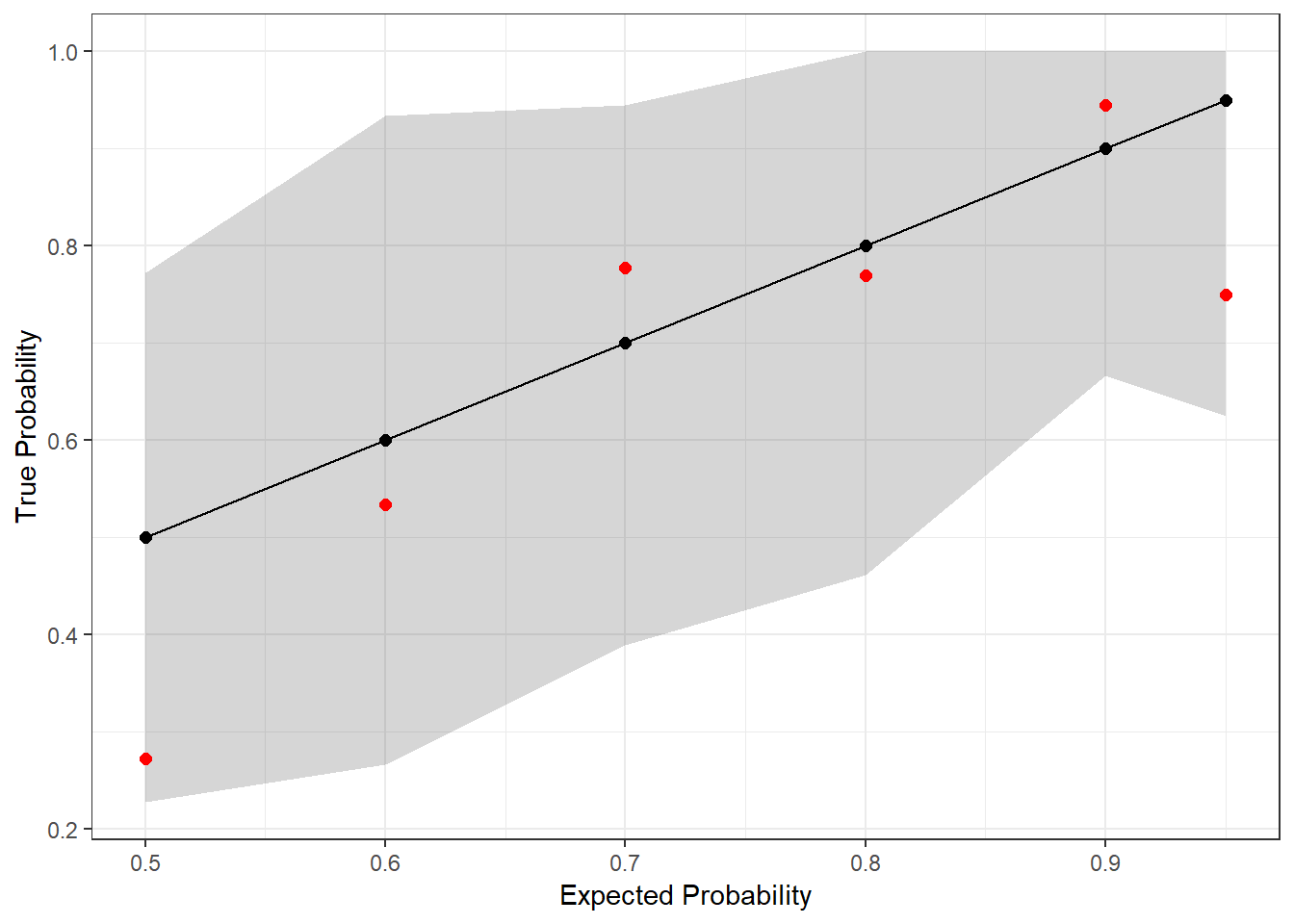
The red dots are the actual outcomes from Scott’s predictions last year, and the gray shaded region represents the simultaneous prediction band. Since every dot is in the band, we once again fail to find evidence that Scott is mis-calibrated (at the 95% confidence level)!
Note that the bands aren’t uniform width. Typically, the variance in binomial draws decreases as you move away from \(p = 0.5\), but in this case, we also have different numbers of observations in each bin. This is why you see, for example, the prediction band narrow at \(p = 0.9\) and then widen again at \(p = 0.95\); there were 18 predictions that Scott placed into the former bin but only 8 in the latter.
Now, having said that, Bonferroni is notoriously a conservative approach. What would be better would be to look at the joint CDF and build confidence bands off of that somehow.
Using the joint CDF
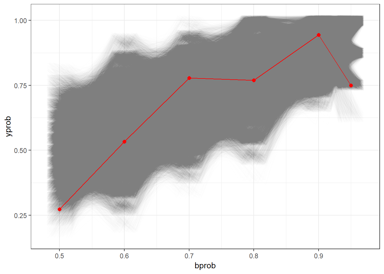
This bit is a little dicey, since we’re going to be estimating the probability of the full outcome instead of trying to treat each bin separately and making a post-hoc correction like we did above. In other words, the above approach defined its acceptance regions as, “50% bin between 5 and 17 correct AND 60% bin between 4 and 14 correct AND …”, this approach will define its acceptance region as discrete sets of outcomes across all six bins(“{16, 12, 13, 16, 6}, {4, 11, 12, 16, 8}, ….”). This means accepting cases where a single bin is unlikely but most of the other bins are likely. To do this, we first have to enumerate all possible combinations:
Then, we estimate the likelihood associated with each of these. We arrange the results in ascending order, from least likely to most likely, taking the cumulative sum of probabilities as we go. This cumulative sum is the p-value associated with each possible outcome!
## # A tibble: 76,114 x 8
##             p `50%` `60%` `70%` `80%` `90%` `95%` `p-value`
##         <dbl> <int> <int> <int> <int> <int> <int>     <dbl>
##  1 0.00000108    14    11    15     8    17     6    0.0500
##  2 0.00000108    13    11    13     7    17     6    0.0500
##  3 0.00000108    10    13    14    10    18     6    0.0500
##  4 0.00000108    12    13    14    10    18     6    0.0500
##  5 0.00000108     8     8     9    11    18     6    0.0500
##  6 0.00000108    14     8     9    11    18     6    0.0500
##  7 0.00000108     7    11    10    12    13     8    0.0500
##  8 0.00000108    15    11    10    12    13     8    0.0500
##  9 0.00000108    11    11    12     6    15     7    0.0500
## 10 0.00000108     7    10    14    13    17     6    0.0500
## # ... with 76,104 more rows
Finally, we can check the p-value of Scott’s outcome:
nb %>%
  bind_cols(tibble(`p-value` = cumsum(nb$p))) %>%
  filter(`50%` == 6,
            `60%` == 8,
            `70%` == 14,
            `80%` == 10,
            `90%` == 17,
            `95%` == 6)
## # A tibble: 1 x 8
## p `50%` `60%` `70%` `80%` `90%` `95%` `p-value`
## <dbl> <int> <int> <int> <int> <int> <int> <dbl>
## 1 0.00000201 6 8 14 10 17 6 0.0797So once again, we fail to reject the null hypothesis that Scott is well-calibrated!
Below, we can see a nice visualization of this hypothesis test, with each candidate within the 95% acceptance region represented as an opaque line. Once again, Scott’s outcome is represented in red.
(As an aside, this plot takes about 3 minutes to draw on my PC due to the hundreds of thousands of lines being drawn.)
What about Bayes?
So sure, we did a bunch of frequentist calculations and barely failed to reject some hypotheses, but surely any good Bayesian would adjust their priors in favor of the idea that Scott is mis-calibrated after seeing these data, right?
Not necessarily, IMO. In fact, a good Bayesian would look back at Scott’s past four years of data and conclude that, hey, he actually does pretty well at this stuff and if anything has generally been too cautious in the past. So keep it up, Scott! And definitely continue to make 50% predictions.
Code for generating the data set
This is the code I used to parse Scott’s text. It’s probably not efficient and isn’t very interesting either, but I wanted to include it for completeness:
library(tidyverse)
tb <- tibble(raw = c("Of 50% predictions, I got 6 right and 16 wrong, for a score of 27%",
                     "Of 60% predictions, I got 8 right and 7 wrong, for a score of 53%",
                     "Of 70% predictions, I got 14 right and 4 wrong, for a score of 78%",
                     "Of 80% predictions, I got 10 right and 3 wrong, for a score of 77%",
                     "Of 90% predictions, I got 17 right and 1 wrong, for a score of 94%",
                     "Of 95% predictions, I got 6 right and 2 wrong, for a score of 75%")) %>%
  mutate(bin = str_extract(raw, "[0-9][0-9]%"),
         right_start = str_extract(raw, "\\d{1,3} right"),
         right = str_extract(right_start, "\\d{1,3}"),
         wrong_start = str_extract(raw, "\\d{1,3} wrong"),
         wrong = str_extract(wrong_start, "\\d{1,3}"),
         x = as.numeric(right),
         n = x + as.numeric(wrong),
         p = x/n,
         bin_simple = str_extract(bin, "\\d{1,2}"),
         bin_numeric = as.numeric(bin_simple)) %>%
  select(bin, bin_numeric, right, wrong, x, n, p)