DIY Metrics: Full-season five-man Plus/Minus
Previously on DIY Metrics, we did some remedial cleaning on the full 17-18 play-by-play data set. Today, we’re going to take that clean data, generate full-season five-man plus/minus numbers, and then do some plotting!
Cleaning, again
So, turns out there were a few bugs that I didn’t catch the first time we went through the cleaning process. This is fairly typical in my experience: You’ll go through your data cleaning and think everything is Gucci only to find once you start your analysis that there are irregularities or issues you hadn’t considered. In this case, I discovered that occasionally, players weren’t being accurately placed on the right teams. Turns out, jump balls are coded weirdly in the data set, but once we chuck them out, everything looks much better!
I think its instructive to consider how we arrived at this point. I started out this morning by taking the “cleaned” data from last week and running the code we used in the Net Ratings(ish) post. And everything worked! (This should’ve been my first warning.) However, there were waaaay too many unique five-man units. Turns out, the original data set wasn’t always consistent about where it was putting players in positions 1 through 5. This mean that when I grouped on the five player columns, identical player groups would be separated if the players weren’t always in the same columns. So I went back and added a function to re-organize the players alphabetically:
The get_team_events function is the workhorse for generating the data table of play-by-play events from each team’s perspectives. If you compare the version below to the one from our previous post, you’ll note the additional mutate statement, which first alphabetizes and then re-orders the five players.
get_team_events <- function(whichteam, tb){

  out <- NULL
  for(i in seq_along(whichteam$team)){

    thatteam <- whichteam$team[i]

    teamtbl <- tb %>%
      mutate(currentteam = thatteam) %>%
      filter(hometeam == currentteam | awayteam == currentteam) %>%
      fiveplayers() %>%
      mutate(fiveplayers = pmap(list(p1, p2, p3, p4, p5), make_player_list),
             p1 = map_chr(fiveplayers, get_player, 1),
             p2 = map_chr(fiveplayers, get_player, 2),
             p3 = map_chr(fiveplayers, get_player, 3),
             p4 = map_chr(fiveplayers, get_player, 4),
             p5 = map_chr(fiveplayers, get_player, 5)) %>% select(-fiveplayers)


    thisteamsplayers <- get_this_teams_players(teamtbl, thatteam)

    out <- teamtbl %>%
      add_subsections(thisteamsplayers) %>%
      mutate(netpoints = pmap_dbl(list(points, currentteam, team), get_net_points)) %>%
      select(-team) %>% rename(team = currentteam) %>%
      bind_rows(out)

  }
  out %>% group_by(team) %>% nest(.key = `team events`)

}
There are probably better ways to do this than the approach I used, but I wanted to cause minimal changes throughout my code, and since this cleaning step is done infrequently, I’m not too bothered about efficiency.
Now the fun stuff!
Now that we’ve ironed out a few wrinkles in our data, we can start having fun with it! First, let’s just look at what our five-man plus/minus numbers look like:
fpm <- tmp %>% filter(team == "SAS") %>% select(`Five-man Plus/Minus`) %>% unnest() %>%
  filter(unittime > 0) %>%
  mutate(normpm = `Plus/Minus` * 48 * 60 / unittime)

fpm
## # A tibble: 566 x 8
## p1 p2 p3 p4 p5 `Plus/Minus` unittime normpm
## <chr> <chr> <chr> <chr> <chr> <dbl> <dbl> <dbl>
## 1 Brandon~ Bryn F~ Danny G~ Dejount~ LaMarcu~ 0 66 0
## 2 Brandon~ Bryn F~ Danny G~ Dejount~ Patty M~ 0 4 0
## 3 Brandon~ Bryn F~ Danny G~ LaMarcu~ Manu Gi~ 0 3 0
## 4 Brandon~ Bryn F~ Danny G~ LaMarcu~ Patty M~ -7 109 -185.
## 5 Brandon~ Bryn F~ Danny G~ Patty M~ Rudy Gay 1 38 75.8
## 6 Brandon~ Bryn F~ Darrun ~ Davis B~ Dejount~ -13 481 -77.8
## 7 Brandon~ Bryn F~ Darrun ~ Davis B~ Derrick~ 2 33 175.
## 8 Brandon~ Bryn F~ Darrun ~ Davis B~ Joffrey~ 10 384 75
## 9 Brandon~ Bryn F~ Darrun ~ Davis B~ Matt Co~ -2 203 -28.4
## 10 Brandon~ Bryn F~ Darrun ~ Dejount~ Joffrey~ -1 60 -48
## # ... with 556 more rowsThe above example looks at the San Antonio Spurs, and the first thing that jumps out is how many five-man units got used! In an NBA regular season, each team will play about 4,000 minutes. (\(48 * 82\) plus overtime.) So what we have here is hundreds of lineups, most of which are used very infrequently. For units that played infrequently, we don’t have much data, and what we do have is going to be very noisy. So let’s concentrate on the units that played at least a full game’s worth of time together:
fpm <- tmp %>% filter(team == "SAS") %>% select(`Five-man Plus/Minus`) %>% unnest() %>%
  filter(unittime > 0) %>%
  mutate(normpm = `Plus/Minus` * 48 * 60 / unittime) %>%
  filter(unittime > 60 * 48)

fpm %>% print(n = 30)
## # A tibble: 11 x 8
## p1 p2 p3 p4 p5 `Plus/Minus` unittime normpm
## <chr> <chr> <chr> <chr> <chr> <dbl> <dbl> <dbl>
## 1 Brandon~ Bryn F~ Davis B~ Dejount~ Joffrey~ -8 2956 -7.79
## 2 Bryn Fo~ Dejoun~ Kyle An~ LaMarcu~ Pau Gas~ 8 2993 7.70
## 3 Bryn Fo~ Manu G~ Pau Gas~ Rudy Gay Tony Pa~ 29 3081 27.1
## 4 Danny G~ Dejoun~ Kyle An~ LaMarcu~ Patty M~ 43 11762 10.5
## 5 Danny G~ Dejoun~ Kyle An~ LaMarcu~ Pau Gas~ -19 8832 -6.20
## 6 Danny G~ Dejoun~ LaMarcu~ Patty M~ Rudy Gay -40 4820 -23.9
## 7 Danny G~ Kawhi ~ LaMarcu~ Pau Gas~ Tony Pa~ -7 3241 -6.22
## 8 Danny G~ Kyle A~ LaMarcu~ Patty M~ Pau Gas~ 23 9340 7.09
## 9 Danny G~ Kyle A~ LaMarcu~ Pau Gas~ Tony Pa~ 42 4727 25.6
## 10 Davis B~ Dejoun~ Kyle An~ LaMarcu~ Patty M~ 20 3431 16.8
## 11 Dejount~ Kyle A~ LaMarcu~ Patty M~ Pau Gas~ 28 5534 14.6A much more reasonable number! Note that we’ve gotten rid of all of those entries where unittime (the number of seconds the five-player unit was on the court together) was 0 or very small, and now all the normalized plus/minus values seem reasonable. (Recall that normpm is the time-normalized (per-48-minutes) plus/minus.) We can also see that there were some five-player units that did very well for the Spurs (Bryn Forbes, Manu Ginobili, Rudy Gay, and Tony Parker were somehow were plus-27 points per 48 minutes) and others that did poorly (Danny Green, Dejounte Murray, LA, Patty Mills and Rudy Gay were a ghastly -24 points per 48 minutes).
But pictures are more fun than tables, so lets try to show this graphically:
fpm %>%
  ggplot(aes(x = normpm)) + geom_histogram(bins = 10)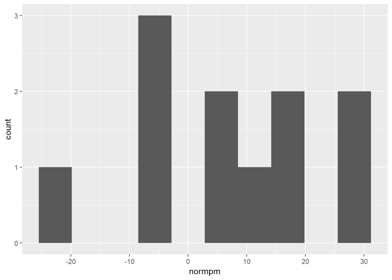
Turns out histograms are kinda ugly when you only have a few data points. Let’s try it with the full league!
tmp %>% select(team, `Five-man Plus/Minus`) %>%
  unnest() %>%
  filter(unittime > 0) %>%
  mutate(normpm = `Plus/Minus` * 48 * 60 / unittime) %>%
  filter(unittime > 60 * 48) %>%
  filter(normpm > -50) %>%
  ggplot(aes(x = normpm)) + geom_histogram(bins = 10)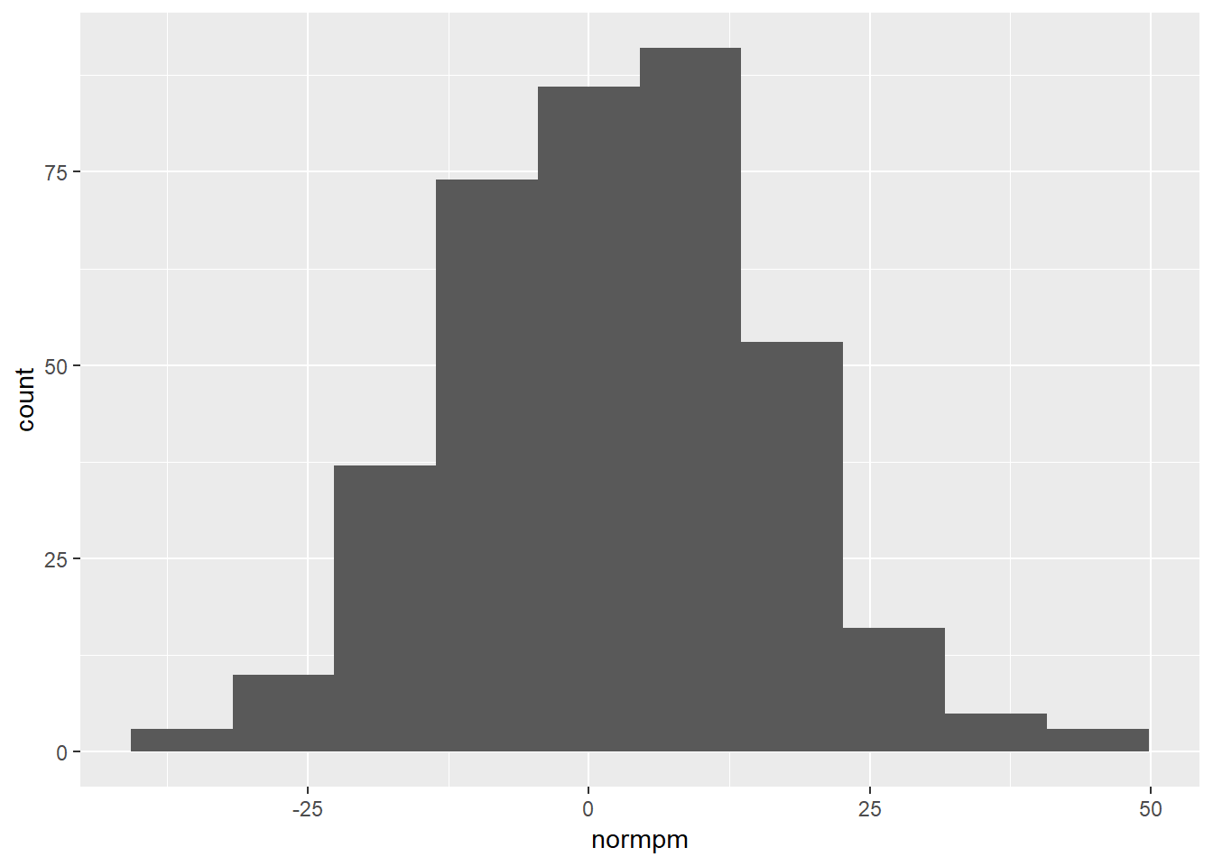
Good stuff! But it’d be nice to visualize which teams fall in which spots along this distribution. So let’s take a brief detour!
Creating an NBA color scale
“Creating” might be a bit grandiose for this, since I’m really just borrowing someone else’s and then putting it into a format that ggplot2 will understand. Nevertheless.
The teamcolors package has primary, secondary, etc. colors for teams from major international sports leagues, including the NBA. So we’ll just borrow those and use them to create a specific NBA color scale. To do this, we’ll follow this tutorial from Simon Jackson.
First, we extract the hex colors from the teamcolors package and match them with the three-letter abbreviations used in our data set. (teamcolors only has the full names for each team, which was… disappointing.) One thing to note is that after matching, I had to re-order the rows by the three-letter abbreviation because the alphabetization isn’t identical!
library(teamcolors)## Warning: package 'teamcolors' was built under R version 3.5.3colortib <- teamcolors %>% filter(league == "nba") %>%
bind_cols(tibble(team = c("ATL", "BOS", "BKN", "CHA", "CHI",
"CLE", "DAL", "DEN", "DET", "GSW",
"HOU", "IND", "LAC", "LAL", "MEM",
"MIA", "MIL", "MIN", "NOP", "NYK",
"OKC", "ORL", "PHI", "PHX", "POR",
"SAC", "SAS", "TOR", "UTA", "WAS"))) %>%
arrange(team)
nbacolors <- colortib$primary
names(nbacolors) <- colortib$teamFor the next bit, I’d recommend you go read the tutorial I linked above. I’m mostly doing exactly what is described there. One key difference is that I’m only interested in discrete scales when talking about matching specific colors with specific NBA teams. As a result, there’s no reason to create a gradient for optional continuous scales.
nbacolors <- colortib$primary
names(nbacolors) <- colortib$teamHere I create the vector of colors with associated team names.
nba_cols <- function(...){

  teamname <- c(...)

  if (is.null(teamname))
    return (nba_colors)

  nbacolors[teamname]
}

nba_pal <- function(whichteams = "all", ...){

  theseteams <- whichteams
  if(whichteams == "all") theseteams <- c("ATL", "BKN", "BOS", "CHA", "CHI",
                                          "CLE", "DAL", "DEN", "DET", "GSW",
                                          "HOU", "IND", "LAC", "LAL", "MEM",
                                          "MIA", "MIL", "MIN", "NOP", "NYK",
                                          "OKC", "ORL", "PHI", "PHX", "POR",
                                          "SAC", "SAS", "TOR", "UTA", "WAS")

  pal <- nba_cols(theseteams)

  colorRampPalette(pal, ...)
}
One thing to note here is that you can choose a subset of teams/colors; that’s what all the whichteams stuff is about. The default is to use all of them, and if you only have a few teams in your data, it won’t automatically choose the right colors. Instead, you’ll have to manually input the teams you want when you specify your color scale in the ggplot statement later on.
scale_color_nba <- function(whichteams = "all", ...){

  pal <- nba_pal(whichteams = whichteams)

  discrete_scale("colour", paste0("nba_discrete_", whichteams),
                 palette = pal, ...)

}

scale_fill_nba <- function(whichteams = "all", ...){

  pal <- nba_pal(whichteams = whichteams)

  discrete_scale("fill", paste0("nba_discrete_", whichteams),
                 palette = pal, ...)

}
Note again the whichteams argument which is passed to discrete_scale via pal.
Back to making pictures!
Now with our color scale defined, we can make a couple different plots showing the distribution of plus-minus by team. First, across the full NBA:
tmp %>% select(team, `Five-man Plus/Minus`) %>%
  unnest() %>%
  filter(unittime > 0) %>%
  mutate(normpm = `Plus/Minus` * 48 * 60 / unittime) %>%
  filter(unittime > 60 * 48) %>%
  filter(normpm > -50) %>%
  ggplot(aes(x = normpm, color = team, y = 1, size = (unittime/60))) +
  geom_jitter(width = 0) + scale_color_nba() + theme_bw() + ylab("") +
  theme(legend.position = "top") + xlab("Plus/Minus") +
  scale_y_continuous(labels = NULL) +
guides(size = guide_legend(title = "Minutes Played")) 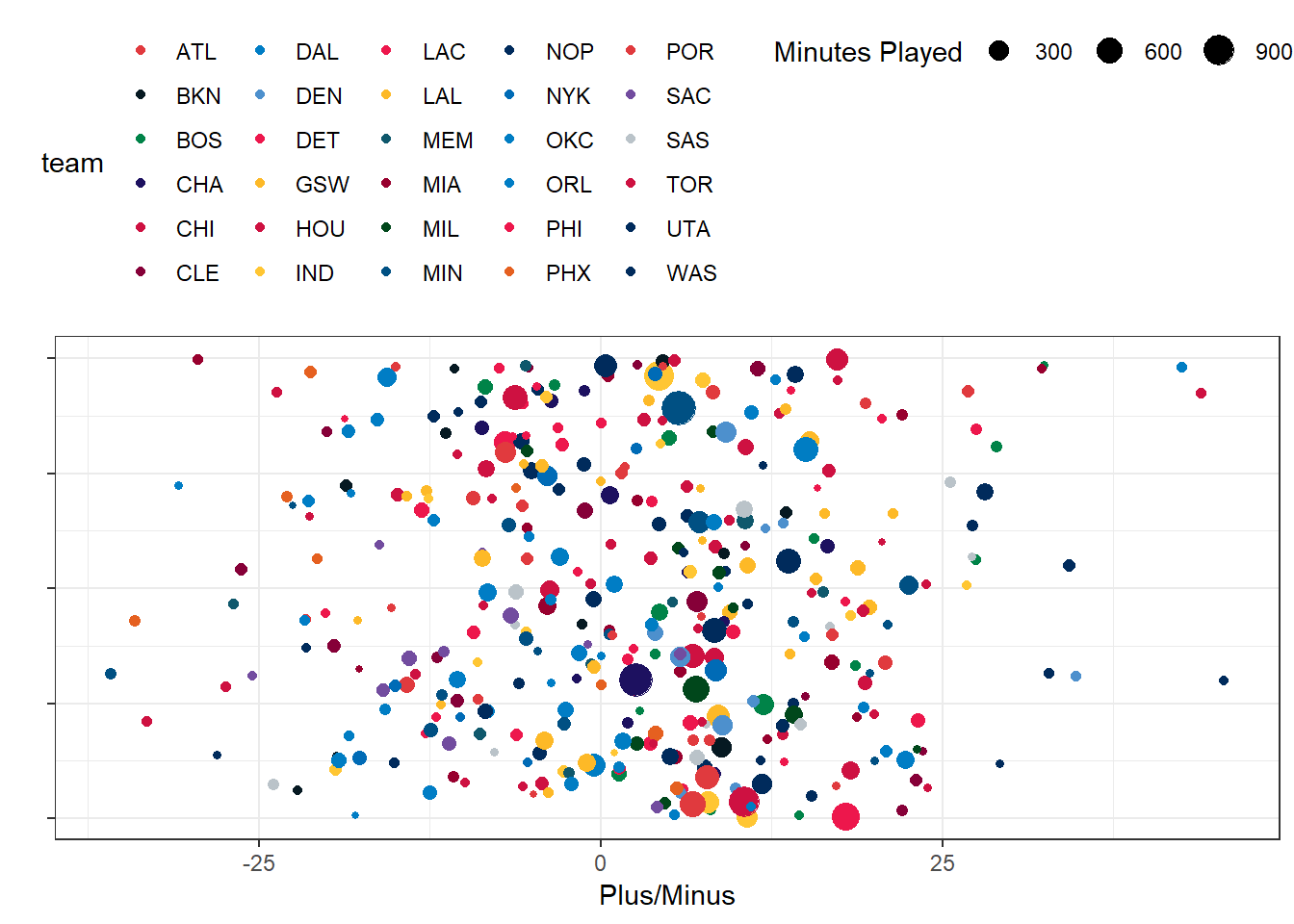
In this picture, the larger the dot, the more the five-player unit has played together. Note that the y-axis is jitter induced to make it easier to see the individual dots. This illustrates the spread across the NBA, but the colors aren’t great at helping us distinguish one team from another. So let’s try a different approach:
tmp %>% select(team, `Five-man Plus/Minus`) %>%
  unnest() %>%
  filter(unittime > 0) %>%
  mutate(normpm = `Plus/Minus` * 48 * 60 / unittime) %>%
  filter(unittime > 60 * 48) %>%
  filter(normpm > -50) %>%
  ggplot(aes(x = normpm, color = team, y = 1, size = (unittime/60))) +
  geom_jitter(width = 0) + scale_color_nba() + theme_bw() + ylab("") +
  theme(legend.position = "top") + xlab("Plus/Minus") +
  scale_y_continuous(labels = NULL) +
  guides(size = guide_legend(title = "Minutes Played")) +
  facet_wrap(~team)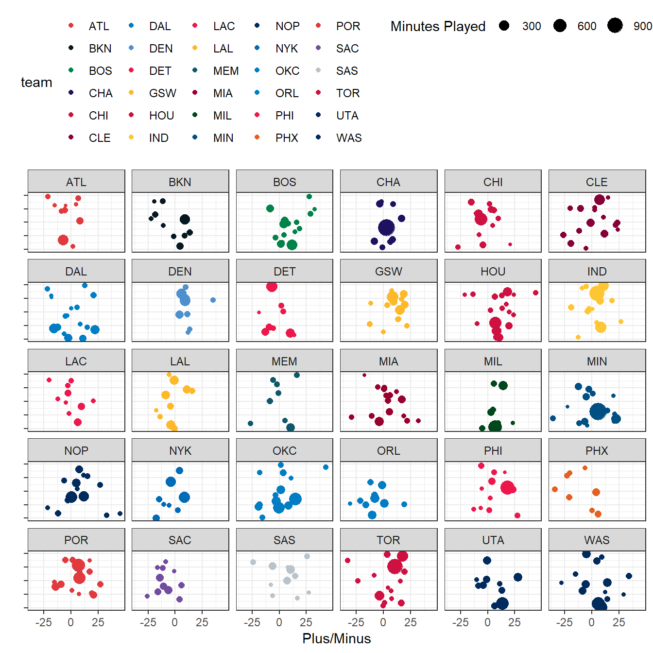
By adding facet_wrap, we break out each team separately, allowing us to get a pretty good look at what each team is doing in terms of plus/minus for five-player units. For example, we can see that Denver was pretty consistent and didn’t have any single unit that played a ton of time together. Minnesota and Charlotte, on the other hand, both had a single five-player unit that was by far their most played group. Almost every Golden State unit was a net-positive, while the opposite is true for Phoenix and Atlanta. The Spurs has a lot of variability, including some very good and very bad units, while the Lakers and Nuggets were more consistent.
And of course, if we just want to compare a couple of teams, we can do this as well:
tmp %>% select(team, `Five-man Plus/Minus`) %>%
  unnest() %>%
  filter(unittime > 0,
         team == "BOS" | team == "SAS") %>%
  mutate(normpm = `Plus/Minus` * 48 * 60 / unittime) %>%
  filter(unittime > 60 * 48) %>%
  filter(normpm > -50) %>%
  ggplot(aes(x = normpm, color = team, y = 1, size = (unittime/60))) +
  geom_jitter(width = 0) +
  scale_color_nba(whichteams = c("BOS", "SAS")) + theme_bw() +
  ylab("") + theme(legend.position = "top") + xlab("Plus/Minus") +
  scale_y_continuous(labels = NULL) +
  guides(size = guide_legend(title = "Minutes Played")) +
  facet_wrap(~team)
## Warning in if (whichteams == "all") theseteams <- c("ATL", "BKN", "BOS", :
## the condition has length > 1 and only the first element will be used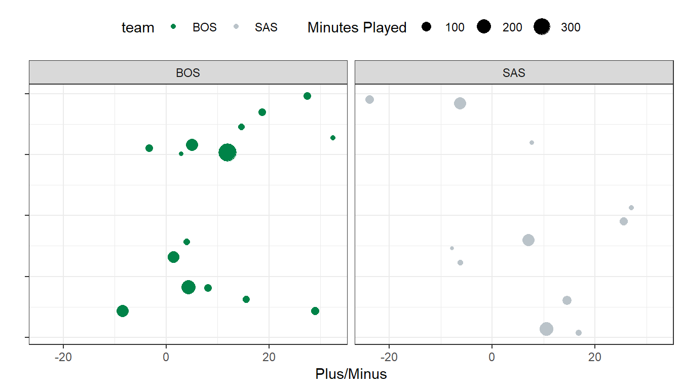
Note that the color scale was described to include Boston and San Antonio only, and they were written alphabetically: scale_color_nba(whichteams = c("BOS", "SAS")).
Wrap-up
That’s all for today! I’m happy with how much we were able to get done. We’ve got full-season plus/minus data for all five-player units in the NBA! We can visualize them with a nice NBA-team-specific color scale. Not a bad morning’s work!